Dashboard Guide
How to use this site
Throughout the COVID-19 pandemic local surges have caused many hospitals across the US to reach or exceed their capacity, and with the ongoing spread of the virus we expect this to continue. Hospitals can cope with surges through a variety of methods, which typically involve opening up capacity, but these are often costly and can hurt the level of care that patients receive. A promising alternative method for reducing the burden on hospitals is to optimally transfer patients from over-capacity hospitals to nearby hospitals that have available space. This dashboard allows you to explore the potential impact of patient transfers on hospital systems around the US.
This site is organized into a few pages. The Dashboard page allows you to select a state and patient level-of-care, and see the impact transfers would have on hospitals state-wide. The Customize Results page allows you to go deeper and modify the parameters to our optimal redistribution model, which runs in real-time to update the results. You can set parameters like a limit on the number of transfers that can be done, how far patients can be transferred, and what metric the model should try to optimize. You can also select the specific hospitals and date range you are interested in. The Nearby Hospitals page shows you all of the hospitals near you and how much capacity they have left so you can make informed decisions on where to go to the hospital. Finally, the About page will give you more details about this project.
The Dashboard and Customize Results pages allow you to visualize and explore the toll that COVID is taking on hospitals as well as the potential benefits that patient transfers could have in many ways. Want to visualize the transfers we recommend and the load hospitals would face? Take a look at the map of COVID occupancy and transfers. Want to see how transfers help hospitals that will be over capacity? Check out the hospital-level COVID occupancy figure. Want to look into the empirical effect of COVID and transfers on the shortages at hospitals? Go to the metrics section.
Example: Las Vegas, NV
To demonstrate how this site can be used we are going to use the example of the Las Vegas, NV hospital system during the fourth wave of the pandemic. Specifically we are going to look at the 26 hospitals in the Las Vegas Hospital Referral Region that have ICU capacity from July 14, 2021 to August 15, 2021.
The figure below shows the overall load of the hospital system over that time period, normalized by its bed capacity, so that when the blue line is in the green region it is under capacity and when it is in the red region it is over capacity. The figure clearly shows that the system as a whole was well under capacity for the entire period.

However, since patients don’t distribute themselves evenly between hospitals, just because the system as a whole was under capacity does not mean each hospital was under capacity. In fact, in this next figure we can see that some hospitals were well over capacity. Instead of plotting the overall load of the system, the figure below plots the load at each hospital in the system individually.

The large load imbalances that we see where some hospitals had to create lots of extra capacity while others were relatively empty suggests that patient transfers could have been very helpful. Since the system as a whole was under capacity, if transfers were done correctly, every hospital should have been able to be under capacity. The figure below compares the load at individual hospitals with and without optimal transfers. We can see that the load at every hospital could have been brought below capacity in a matter of just a few days.

In addition to seeing the impact of transfers on hospitals in the system, our dashboard can show the transfers themselves. The figure below shows these transfers on an animated map. These figures, and the others that we display on the dashboard, can help you (or decision-makers in hospital systems) explore the transfers recommended by our optimization model and the potential impacts of those transfers.
Although we are calling the transfers recommended by our model “optimal” that is only with respect to the default constraints that our model tries to satisfy and the default objective that it tries to optimize. Different hospital systems will have different operational capabilities and constraints that they need to follow, and different hospital-system administrators will have different ideas about what the objective of transferring patients should be. Our dashboard therefore allows them, and you, to modify some of the constraints and objectives of our model and re-run it in real time to see how they would effect the recommended transfers and the impacts of those transfers.
The default objective of our model is to minimize the total surge capacity required – that is the number of patient-days of capacity that hospitals will need to add to accommodate all COVID-19 patients. This will try to get all hospitals that are over capacity back down to capacity. However, as you can see in the plot of hospital loads over time with transfers, even with transfers there can be a significant difference between loads at different hospitals. In many cases this is ok because at least all hospitals will be at or under capacity, but some systems may want to go further and ensure equality by balancing out the loads completely to ensuring that all hospitals face the same patient load. This can be beneficial to the care that patients receive, but also can require many more patient transfers. Our dashboard enables you to try out load balancing by going to the Objective option, and changing it from “Minimize Surge Capacity (Bed-Days)” to “Load Balance”. The loads at individual hospitals with load balancing are shown below. Note that this solution requires 199 patient transfers rather than just 88 patient transfers to minimize the required surge capacity.

While patient transfers can be very beneficial for hospitals, most hospital systems are not accustomed to making many transfers and may have a variety of operational constraints around how many patients can be transferred and where they can be transferred. Our model can capture the full range of these constraints, and our dashboard allows you to modify some of them. For example, administrators in the hospital system may decide that they can only transfer 50 patients between hospitals during this time period. In that case, they can change the “Total Transfer Budget” to 50. Making fewer transfers will prevent the model from minimizing the required surge capacity as much as before, but the transfers will still help. The results of transferring just 50 patients can be seen in the figures below.

We explored a few of the parameter choices and figures here, but the dashboard has 15 different options that can be changed and 6 kinds of figures, so we encourage you to try it out!
Region Selection Guide
Throughout the COVID-19 pandemic local surges have caused many hospitals across the US to reach or exceed their capacity, and with the ongoing spread of the virus we expect this to continue. Hospitals can cope with surges through a variety of methods, which typically involve opening up capacity, but these are often costly and can hurt the level of care that patients receive. A promising alternative method for reducing the burden on hospitals is to transfer patients from over-capacity hospitals to nearby hospitals that have available space. Patient transfers have been used throughout the pandemic, but generally they have been used reactively after hospitals had already run out of space and simply could not accept arriving patients. However, with proper planning using data and optimization we could use patient transfers proactively to relieve burden on hospitals. With this aim, we have developed models for optimizing patient transfers between hospitals and applied it to data and forecasts of the COVID-19 pandemic.
One crucial step in implementing optimal patient transfers in practice is determining where they are needed. In regions that are well under capacity patient transfers are not necessary (although they can still be useful to balance loads). Patient transfers are most helpful in regions where the difference between the predicted bed shortage with and without transfers is large. The effectiveness of transfers is determined by the overall load level of the system as well as how unevenly the load was distributed between individual hospitals.
In order to determine which regions could benefit most, we have developed a region selection dashboard which displays regions in the US along with their estimated total bed shortage with and without transfers. The table below shows an example of the tables on this dashboard.
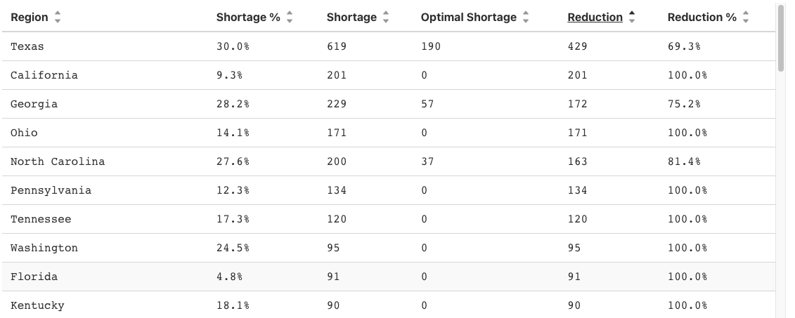
There are four different geographic scales that we consider: states, hospital referral regions (HRRs), hospital service areas (HSAs), and individual hospital systems. Hospital systems are groups of hospitals that are all run by the same company, which makes transfers between them easier as the financial considerations are less significant. Hospital systems may be spread out geographically though, so transferring between hospitals in a HSA, HRR, or state may make more sense in some cases.
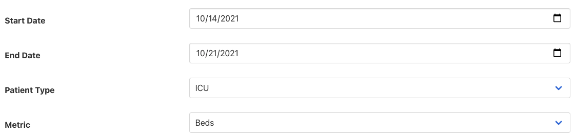
There are a few other options on the dashboard. You can select the starting and ending dates of the analysis, the patient type, and the metric used. Patient type refers to the level of care that the patients included require. The metric option controls the unit for the shortage calculations, which can be bed shortage or bed-day shortage. The bed shortage is the number of beds that hospitals needed to add to care for all patients. The bed-day shortage is the number of bed-days of capacity that hospitals needed to add, which is relevant when also considering nurse and resource availability.